Through My Eyes Press Kit
To gear up for the upcoming PR requests, (the Beijing Olympics were exactly a year out) I designed, from start
to finish, a press kit that included a set of double sided cards, one for each of our athletes, plus a case that holds all of the cards together in one package.
to finish, a press kit that included a set of double sided cards, one for each of our athletes, plus a case that holds all of the cards together in one package.
At the time, Team Speedo consisted of our swim champions, popular triathletes, and AVP pro volleyball athletes. I developed the logotype associated with this project. Our team selected ”Though My Eyes” as the title for the piece. The look and feel of this logo has a hand-rendered, organic feel to reinforce the intimate “Question and Answer” format on the back of each of these cards.

I wanted to give someone a peek into the life of a Speedo athlete. I started with the idea of duality and how it can be expressed in the design. Specifically with color and black and white images. On the outside, our athletes are decorated with medals and all sorts of achievements that they have earned over the course of their careers. On the inside, beneath the surface, at the end of the day, when the competition is over, they are just like us…living our lives in shades of grey.
The front of each card showcases black and white portraits of our athletes to represent who they are to the outside world. The back of each card represents a personal look into each of their lives. Each of the cards were designed with a different modified typeface to again to communicate the individuality of the Team Speedo members.
The press kit yielded a huge spike in our pr efforts to introduce our athletes and the brand in time for the the Olympic season.


Bio cards front Natalie Coughlin
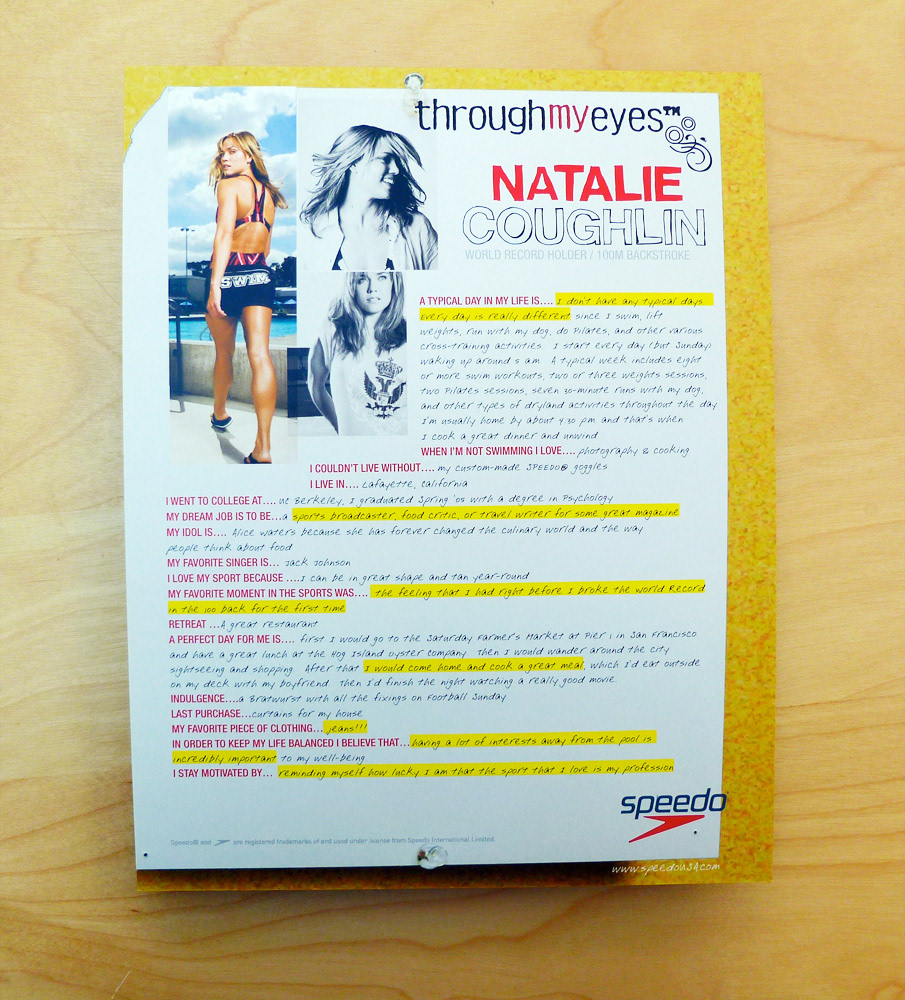
Bio cards back Natalie Coughlin
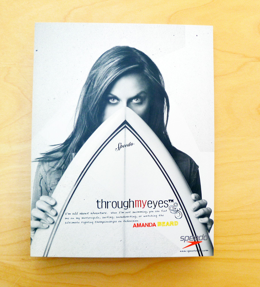
Bio cards front Amanda Beard

Bio cards back Amanda Beard
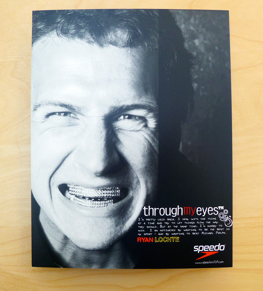
Bio cards front Ryan Lochte

Bio cards back Ryan Lochte


