Sponsored Athlete Press Kits for Upcoming Olympics
Through My Eyes Campaign
Through My Eyes Campaign
As the Beijing Olympics approached, Speedo needed to introduce its world-class athletes to the press in a way that felt both personal and unforgettable. Stepping into this challenge as a mid-level designer, I led the design of the campaign , from naming to visual expression – a project that balanced bold design with genuine human connection.

The Physical Press Kit: Tangible Storytelling
The heart of the initiative was a custom-designed press kit, conceived to be more than just a media package. Each kit featured a sleek, bespoke case holding a set of double-sided cards – one for every Team Speedo athlete, spanning swim champions, triathletes, and AVP pro volleyball players. The front of each card showcased a dramatic black-and-white portrait, capturing the athlete’s public persona. Flip the card, and you’d find a candid Q&A, offering a glimpse into the person behind the accolades. This tactile, collectible format encouraged recipients to slow down and truly engage with each story.
The heart of the initiative was a custom-designed press kit, conceived to be more than just a media package. Each kit featured a sleek, bespoke case holding a set of double-sided cards – one for every Team Speedo athlete, spanning swim champions, triathletes, and AVP pro volleyball players. The front of each card showcased a dramatic black-and-white portrait, capturing the athlete’s public persona. Flip the card, and you’d find a candid Q&A, offering a glimpse into the person behind the accolades. This tactile, collectible format encouraged recipients to slow down and truly engage with each story.
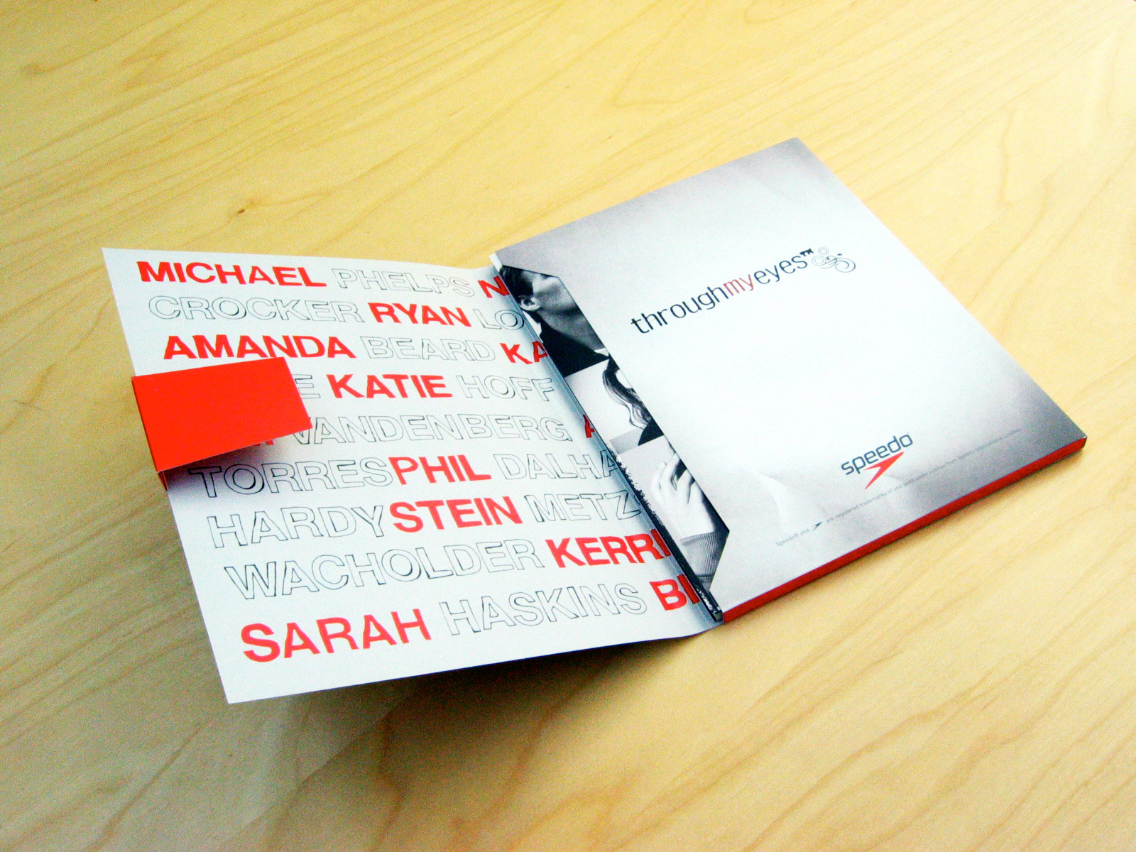
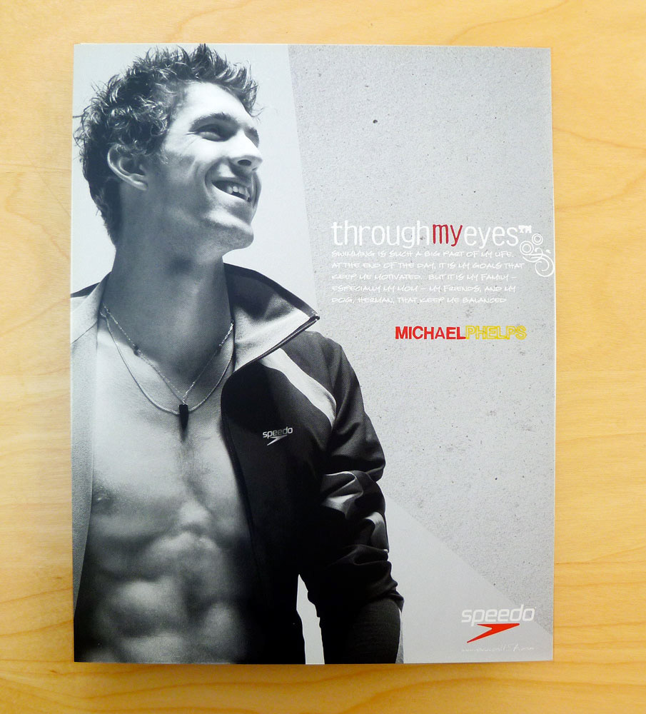
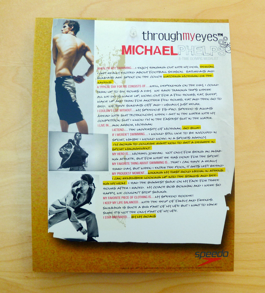
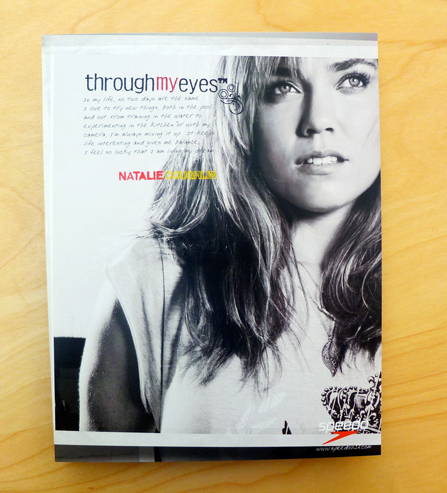
Bio cards front Natalie Coughlin
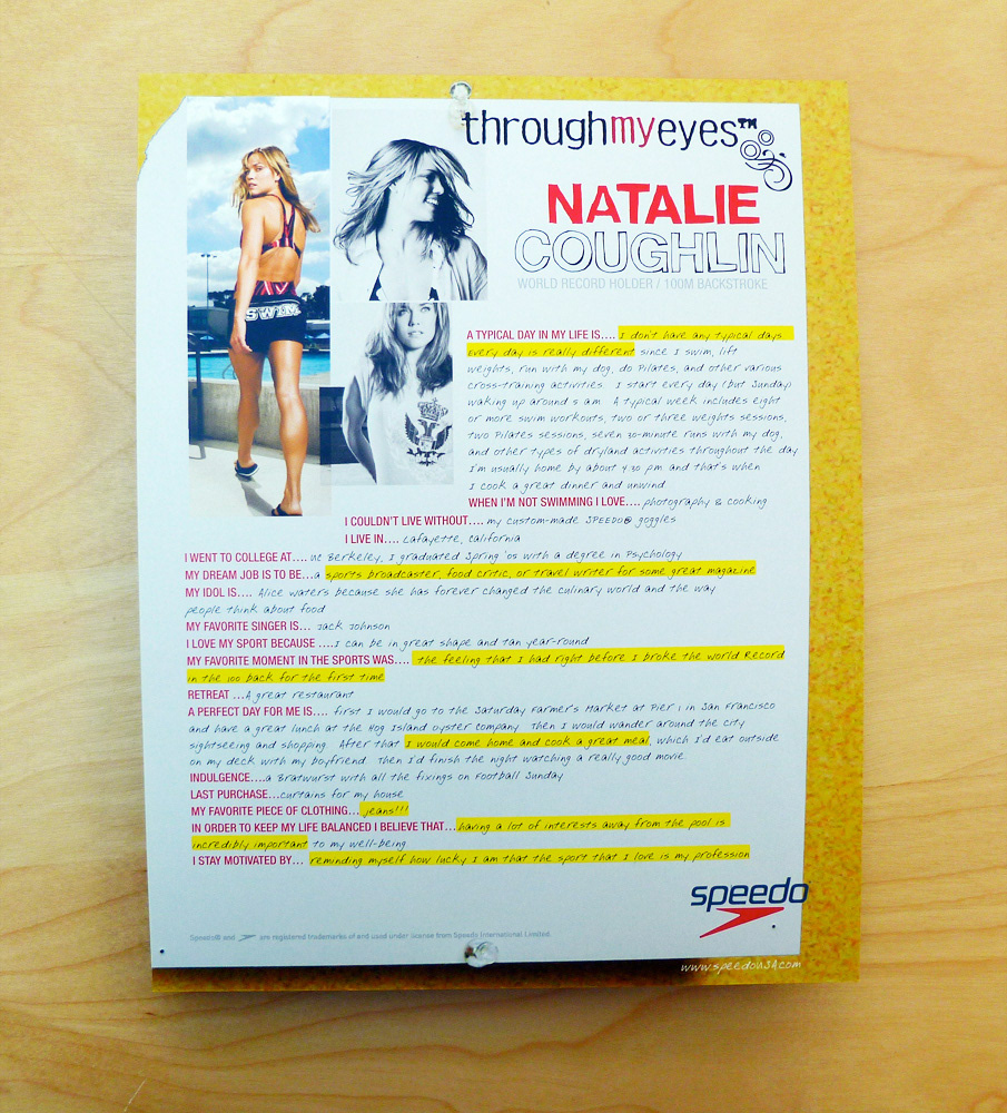
Bio cards back Natalie Coughlin
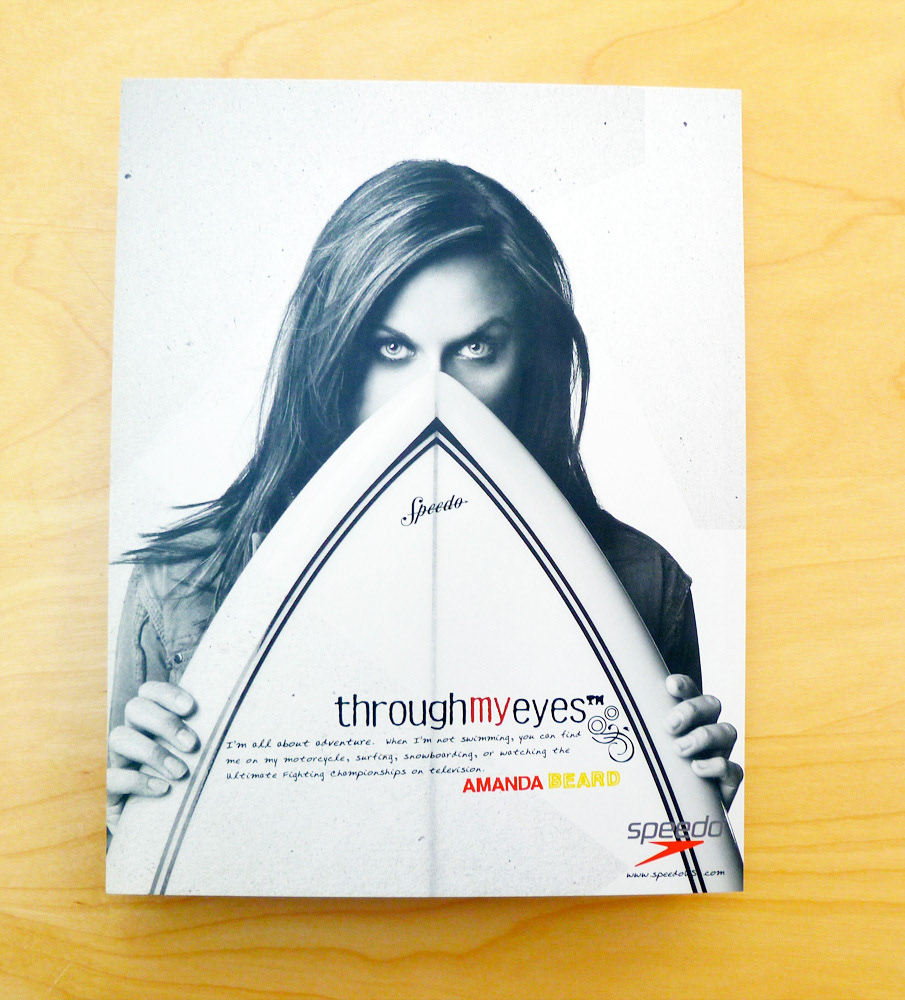
Bio cards front Amanda Beard
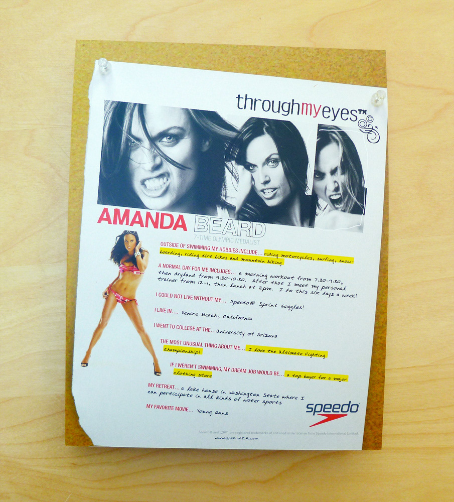
Bio cards back Amanda Beard
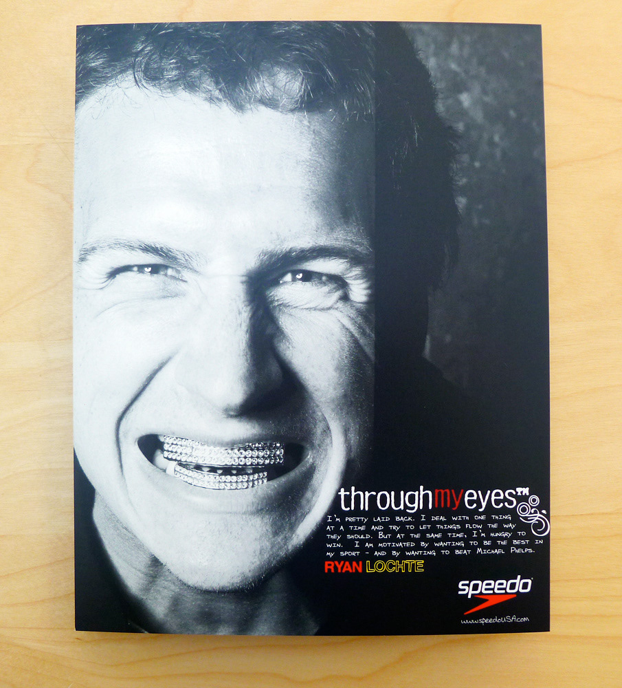
Bio cards front Ryan Lochte
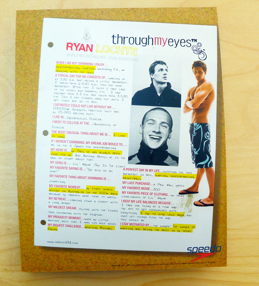
Bio cards back Ryan Lochte
Campaign Identity Duality and the Hand-Rendered Logotype
At the core of Through My Eyes was the concept of duality—the contrast between the athletes’ celebrated public image and their authentic, everyday selves. I developed a hand-rendered logotype for the campaign, infusing the identity with warmth and imperfection to mirror the intimate, honest tone of the Q&As. Every design choice, from the stark photography to the two-sided card structure, reinforced this theme: our athletes are both champions and relatable individuals, living in shades of grey beyond the spotlight.
At the core of Through My Eyes was the concept of duality—the contrast between the athletes’ celebrated public image and their authentic, everyday selves. I developed a hand-rendered logotype for the campaign, infusing the identity with warmth and imperfection to mirror the intimate, honest tone of the Q&As. Every design choice, from the stark photography to the two-sided card structure, reinforced this theme: our athletes are both champions and relatable individuals, living in shades of grey beyond the spotlight.
Individuality Through Typography
To further highlight each athlete’s unique story, I customized the typography on every card. Each name and Q&A was set in a modified typeface, subtly tailored to reflect the personality and journey of its subject. These nuanced typographic choices underscored the campaign’s message: while united as Team Speedo, every athlete brings their own voice and perspective.
To further highlight each athlete’s unique story, I customized the typography on every card. Each name and Q&A was set in a modified typeface, subtly tailored to reflect the personality and journey of its subject. These nuanced typographic choices underscored the campaign’s message: while united as Team Speedo, every athlete brings their own voice and perspective.
Extending the Experience: The Supporting Microsite
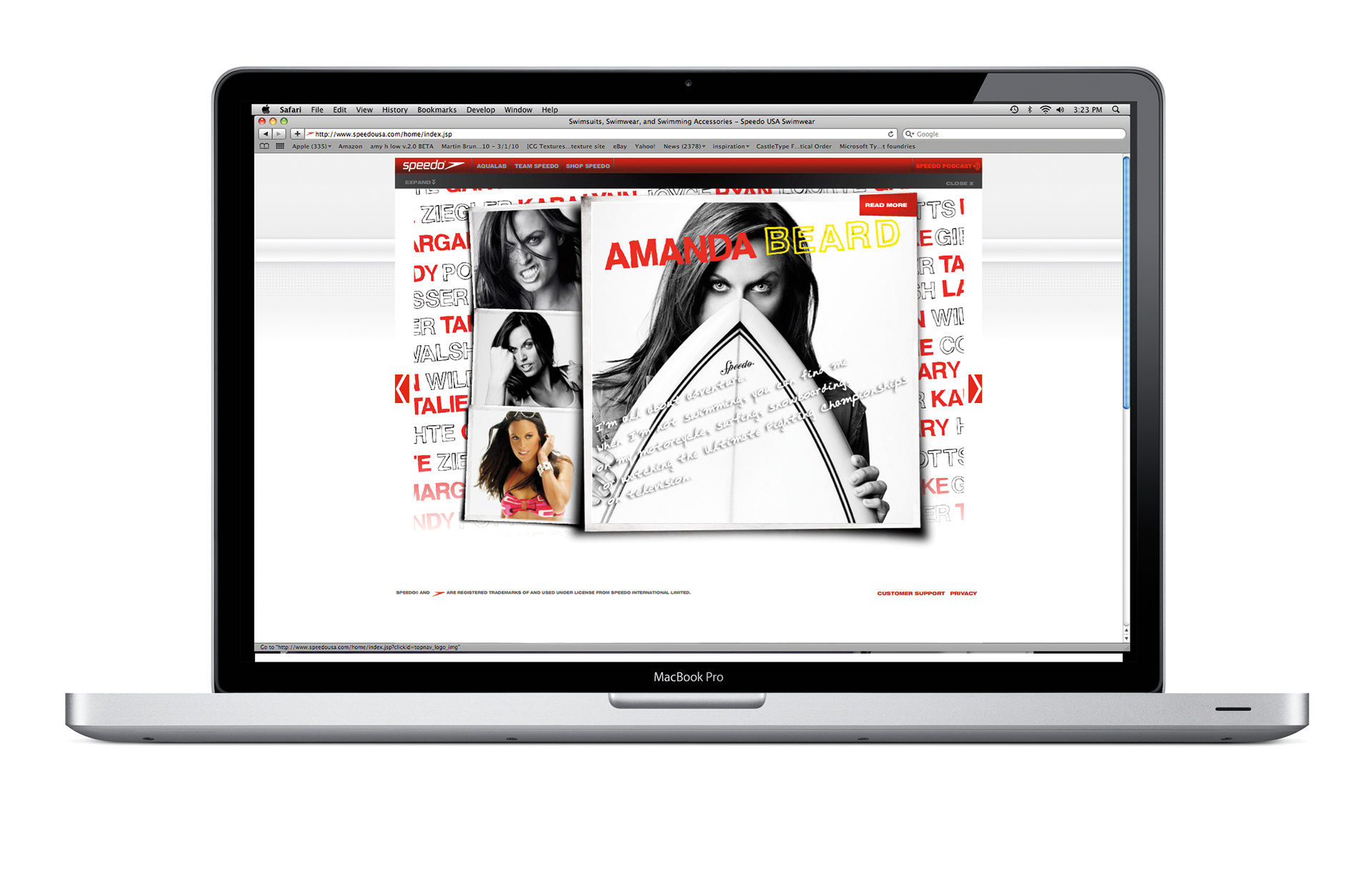
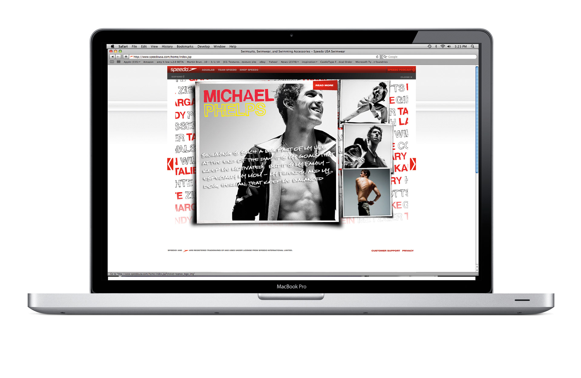
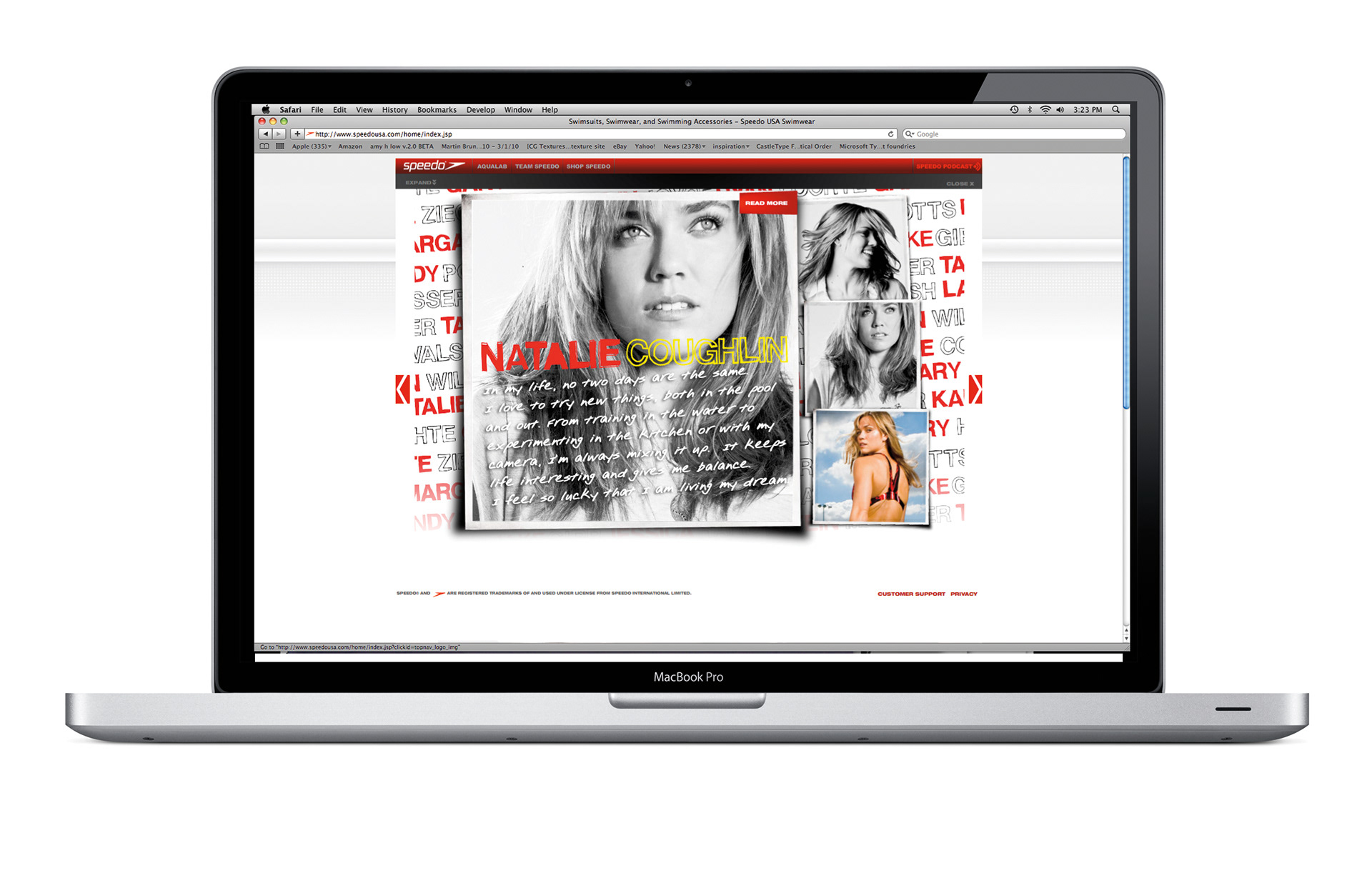
Recognizing the need to amplify the campaign’s reach, I collaborated on the development of a dedicated microsite. This digital extension mirrored the press kit’s visual language—high-contrast portraits, the hand-rendered logotype, and individualized typography—while offering a richer, more interactive experience. Visitors could explore extended athlete stories, behind-the-scenes content, and additional Q&As, deepening their connection to the team. The microsite transformed the press kit from a limited-edition artifact into a living, shareable platform, ensuring that Speedo’s message resonated far beyond the initial press drop.
Recognizing the need to amplify the campaign’s reach, I collaborated on the development of a dedicated microsite. This digital extension mirrored the press kit’s visual language—high-contrast portraits, the hand-rendered logotype, and individualized typography—while offering a richer, more interactive experience. Visitors could explore extended athlete stories, behind-the-scenes content, and additional Q&As, deepening their connection to the team. The microsite transformed the press kit from a limited-edition artifact into a living, shareable platform, ensuring that Speedo’s message resonated far beyond the initial press drop.
Results:
Impactful PR and Brand Momentum
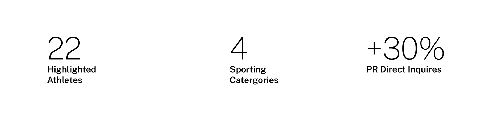
The Through My Eyes campaign delivered exactly what Speedo needed: a significant spike in PR activity and a powerful introduction of the brand and its athletes ahead of the Olympic season. The press kit was celebrated for its premium, personal approach, while the microsite broadened engagement and accessibility. Together, these efforts positioned Speedo at the center of the Olympic conversation—showcasing not just athletic excellence, but authentic human stories.
Impactful PR and Brand Momentum
The Through My Eyes campaign delivered exactly what Speedo needed: a significant spike in PR activity and a powerful introduction of the brand and its athletes ahead of the Olympic season. The press kit was celebrated for its premium, personal approach, while the microsite broadened engagement and accessibility. Together, these efforts positioned Speedo at the center of the Olympic conversation—showcasing not just athletic excellence, but authentic human stories.