Instructional Poster Series
A Pandemic, a Province, and a Communication Gap
A Pandemic, a Province, and a Communication Gap
At the onset of COVID-19, Nova Scotia’s healthcare system faced unprecedented pressure. As a volunteer with the Design to Combat Covid19 community, I joined a team responding to an urgent call from NSHA—Canada’s largest provincial health employer. The task: make PPE guidance clear, fast, and actionable for thousands of staff and volunteers working in high-stress, high-risk environments.
The Nova Scotia Health Authority is Canada’s largest provincial health employer, supporting over 23,000 employees, 2,500 physicians, and 7,000 volunteers across 45 facilities, including the flagship QEII Health Sciences Centre in Halifax. In the midst of a global crisis, NSHA needed communication tools that were not just informative, but instantly actionable – empowering staff to protect themselves and their patients with confidence.
The Challenge
The brief was refreshingly direct:
“Please. Just make them better.”
“Please. Just make them better.”
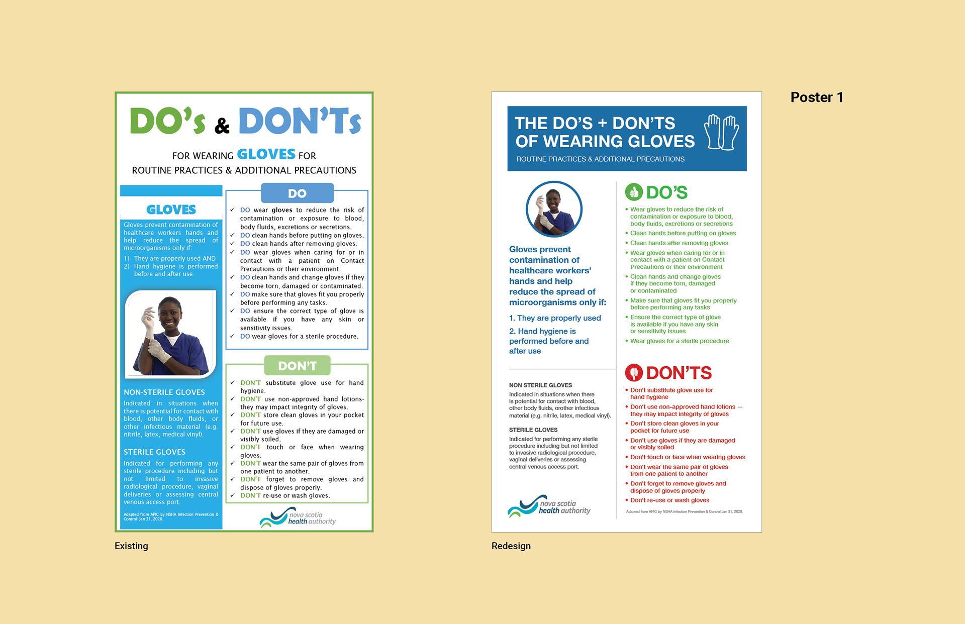
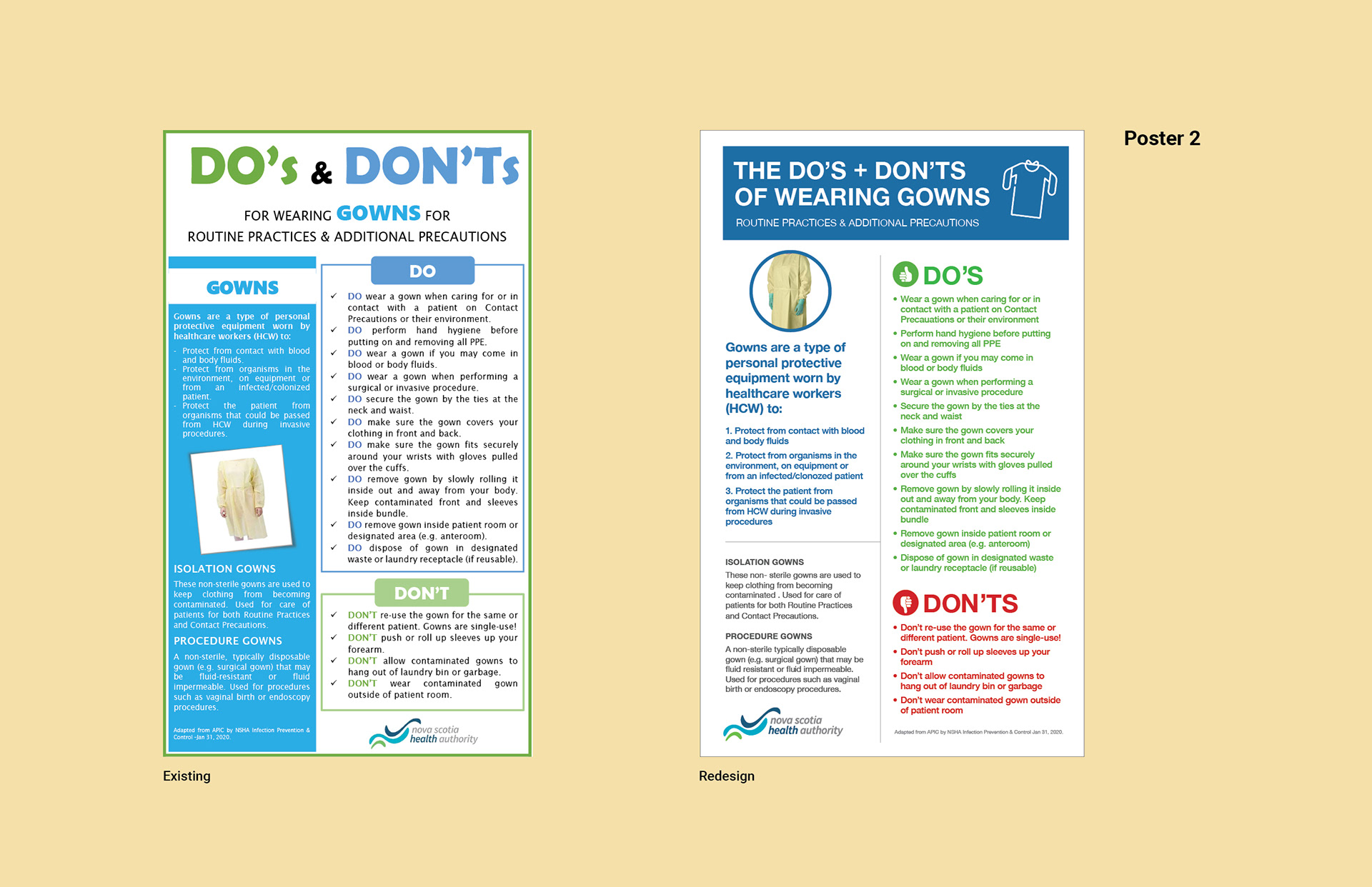
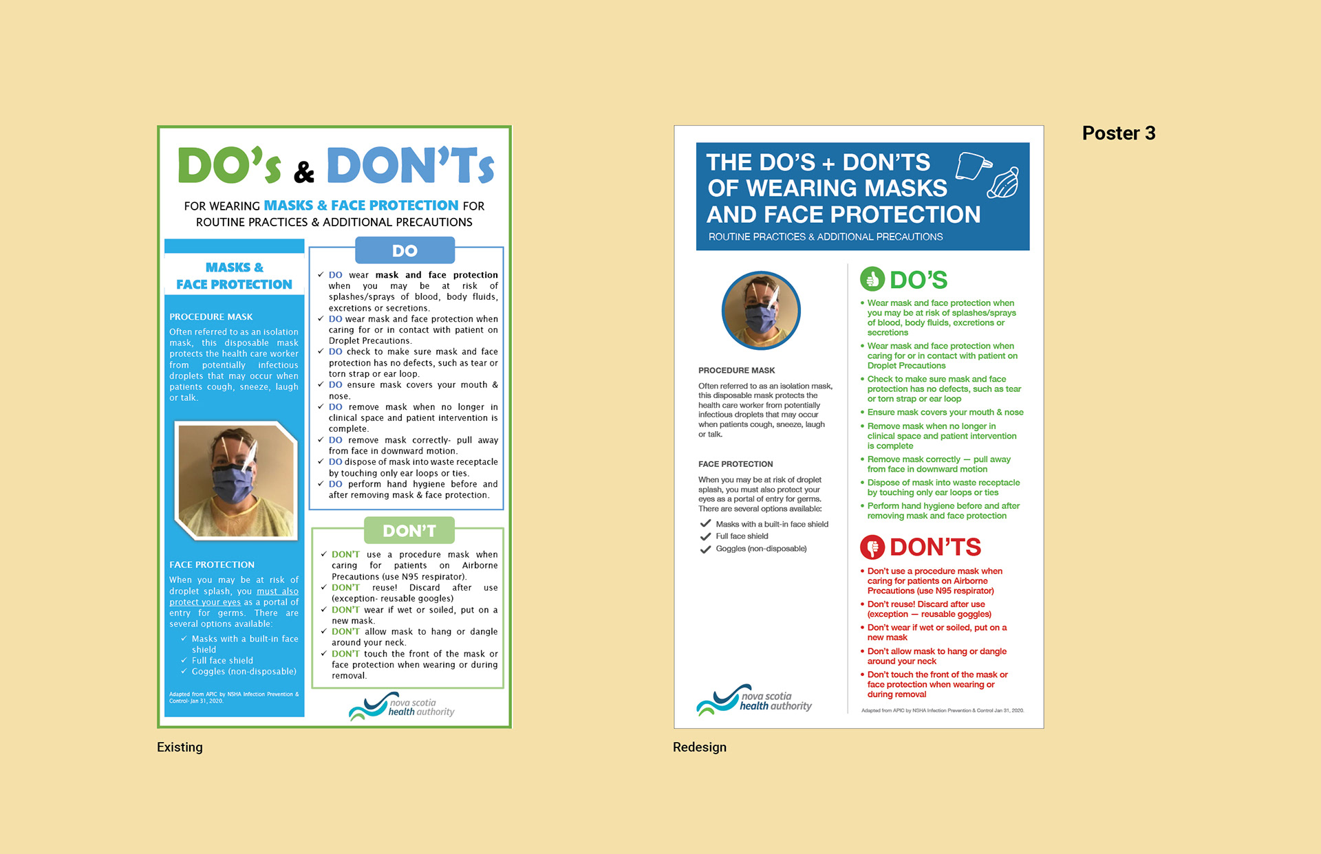
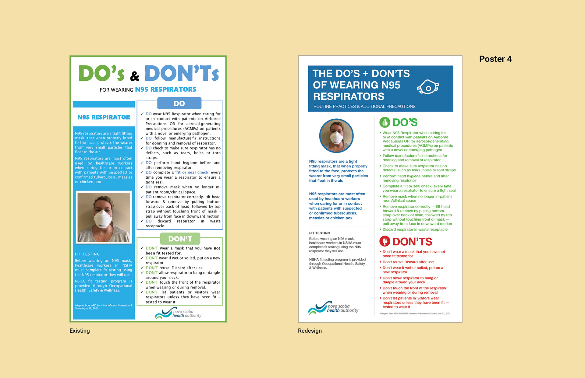
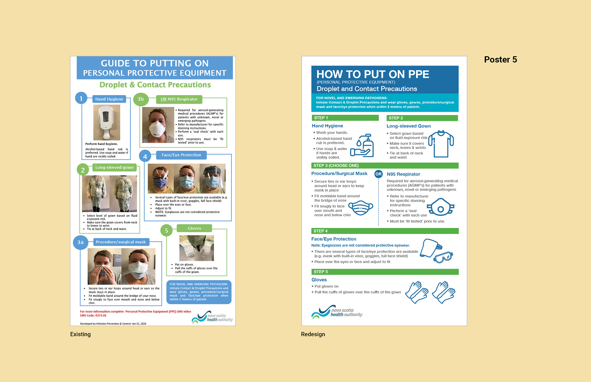
The existing PPE posters – covering how to don protective equipment, glove use, and mask/respirator guidance – were functional in intent but failing in practice. Healthcare workers, often under immense stress and time pressure, needed to absorb critical safety steps at a glance. The original posters, dense with text and lacking visual hierarchy, risked confusion and error at the very moments when clarity was most vital.
Design Process
Diagnosing the Originals
I began by stepping into the shoes of a frontline worker: tired, vigilant, and in motion.
The design of the current posters were:
• Dense, text-heavy layouts with little breathing room.
• Uniform typography—no clear distinction between headings, subheadings, or body text.
• Minimal, low-contrast color palette that failed to guide the eye.
• Sparse, generic icons that added little instructional value.
• Inconsistent or absent numbering, making step-by-step processes hard to follow.
• Verbose, jargon-heavy instructions that slowed comprehension.
Key Design Decisions
Every improvement was made with empathy for the end user:
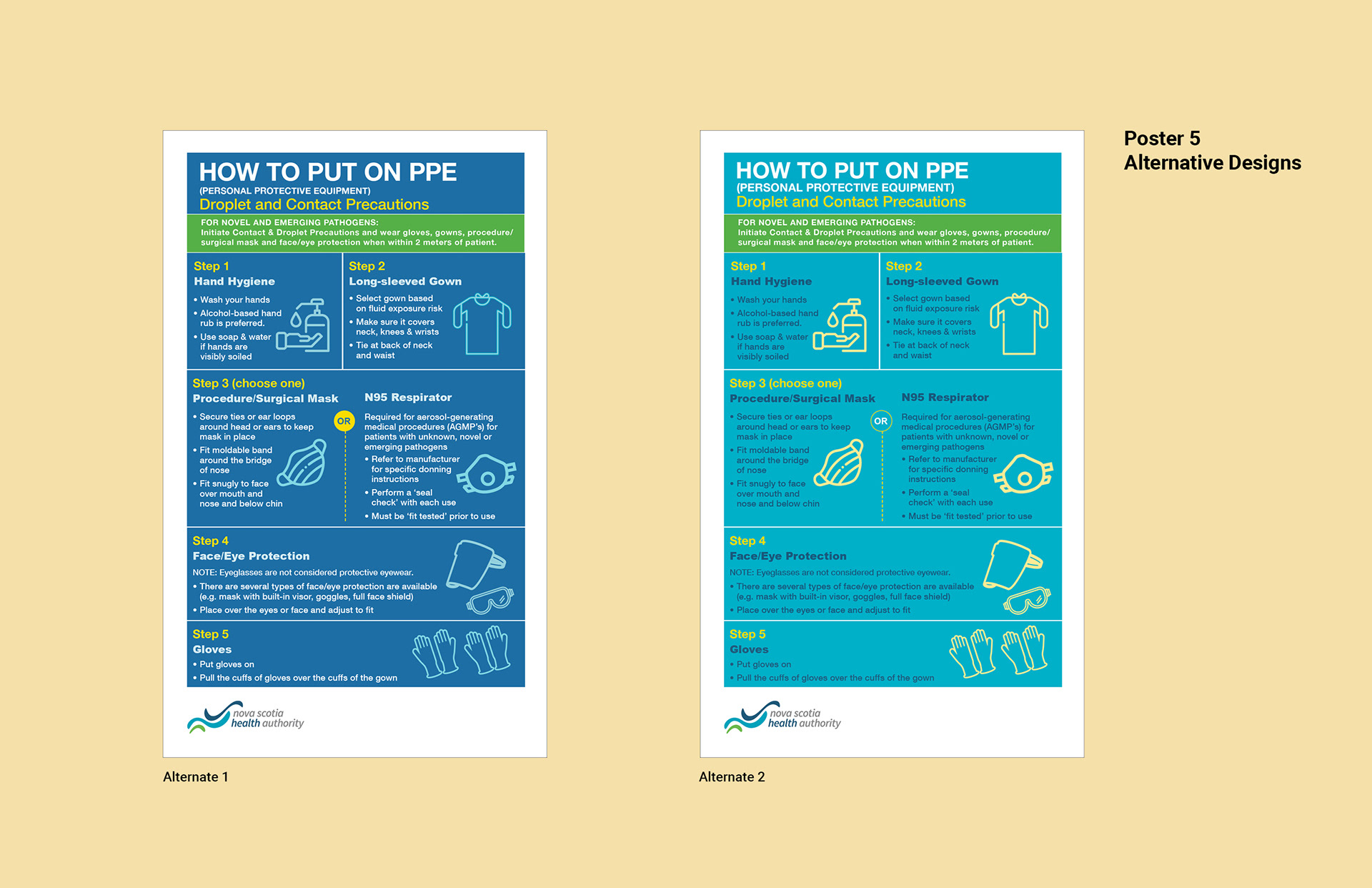
Modular Layout
Introduced clear, sectioned structures with shaded backgrounds and bounding boxes, allowing users to quickly orient themselves and follow the intended flow.
Strong Typographic Hierarchy
Bold, prominent headings and accessible fonts made key information stand out, while medium-weight subheadings and legible body text improved readability.
Large, Context-Specific Icons
Hands for glove steps, face profiles for mask/respirator guidance. Icons to support quick literacy.
Clearly Numbered Steps
Each action was visually separated, numbered, and paired with an illustration, eliminating ambiguity.
Do’s and Don’ts Visual Language and Color
Green checkmarks and red crosses provided instant feedback on correct and incorrect practices, transcending language barriers.
Plain-Language Instructions
Every sentence was rewritten for brevity and clarity – no jargon, no wasted words.
Results & Impact
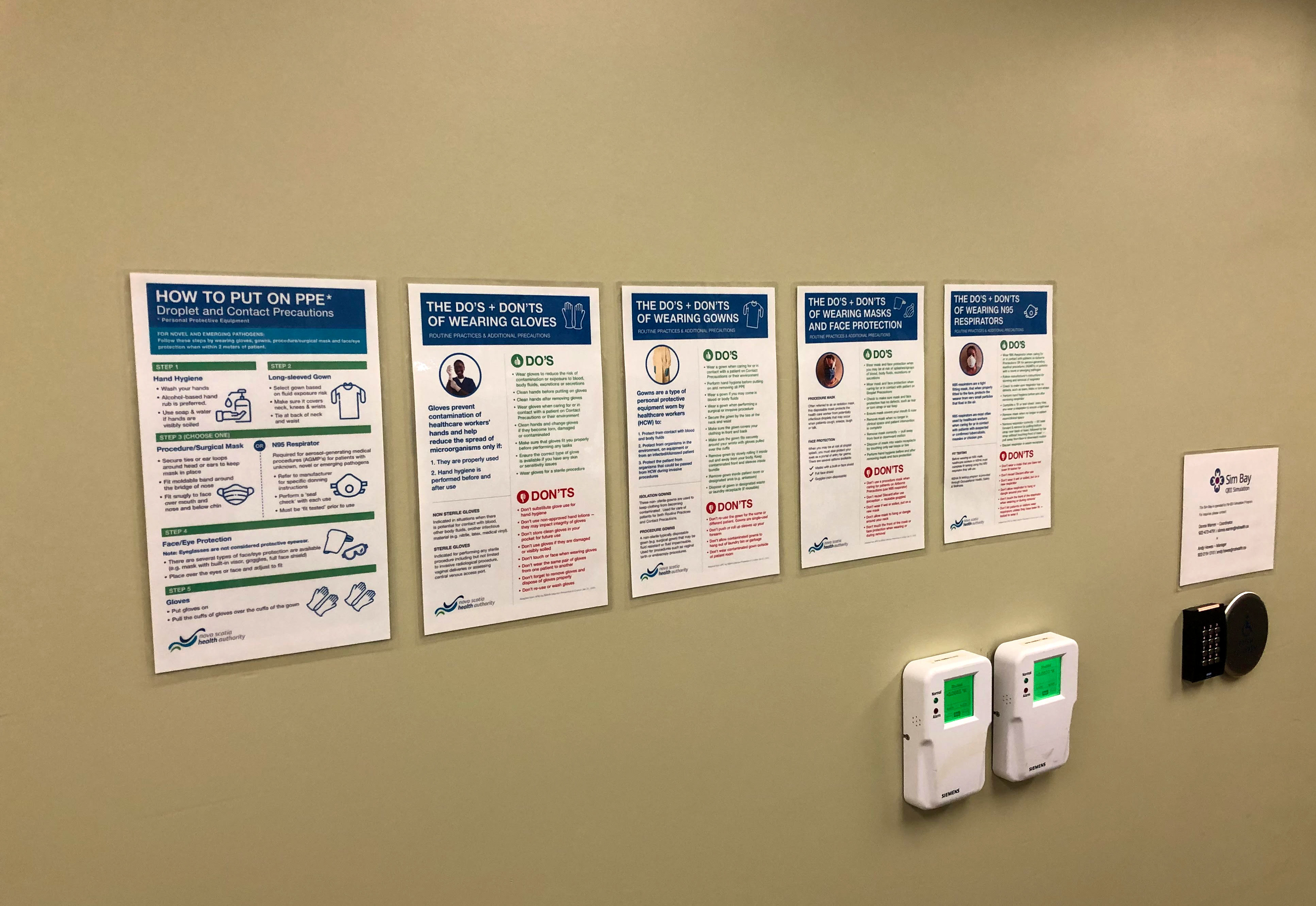
The redesigned posters delivered a dramatic leap in clarity, usability, and professional polish. What was once a wall of text became a navigable, confidence-inspiring reference—something a healthcare worker could consult mid-task without losing their place or composure.
Hypothesis supported
Good design in high-stakes contexts is empathy made visible. By understanding the real-world needs and constraints of frontline workers, I was able to create materials that not only looked better, but truly worked better.