Brand Marketing Design Systems
Extending the Visual Design Language for Egencia's New Brand Identity
Extending the Visual Design Language for Egencia's New Brand Identity
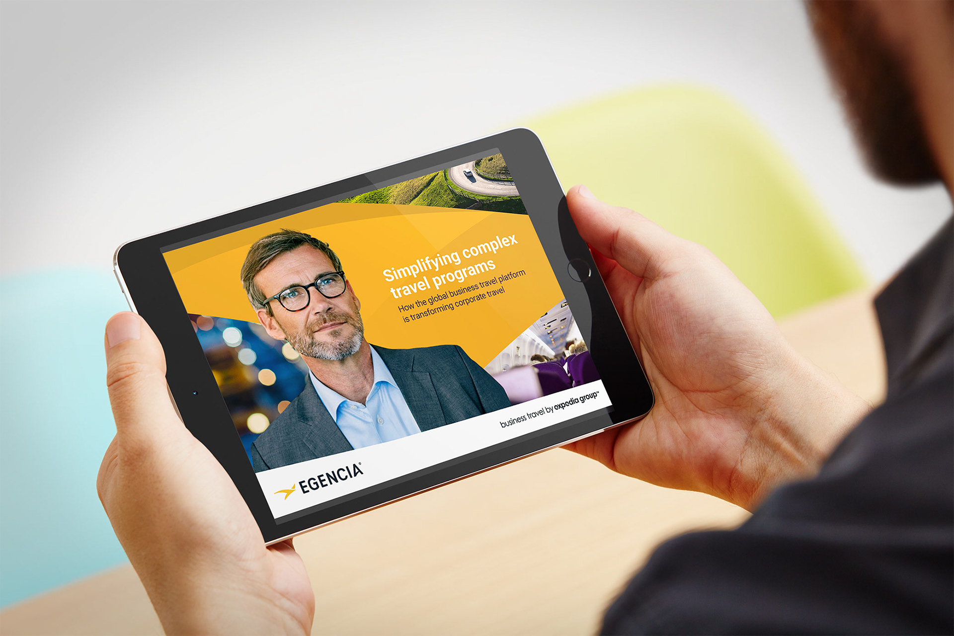
Egencia, the business travel arm of Expedia Group, operates in a fast-paced, competitive B2B landscape where brand distinction is crucial. To elevate its market presence, Egencia partnered with an agency to develop a vibrant new brand strategy
The result was a striking visual identity
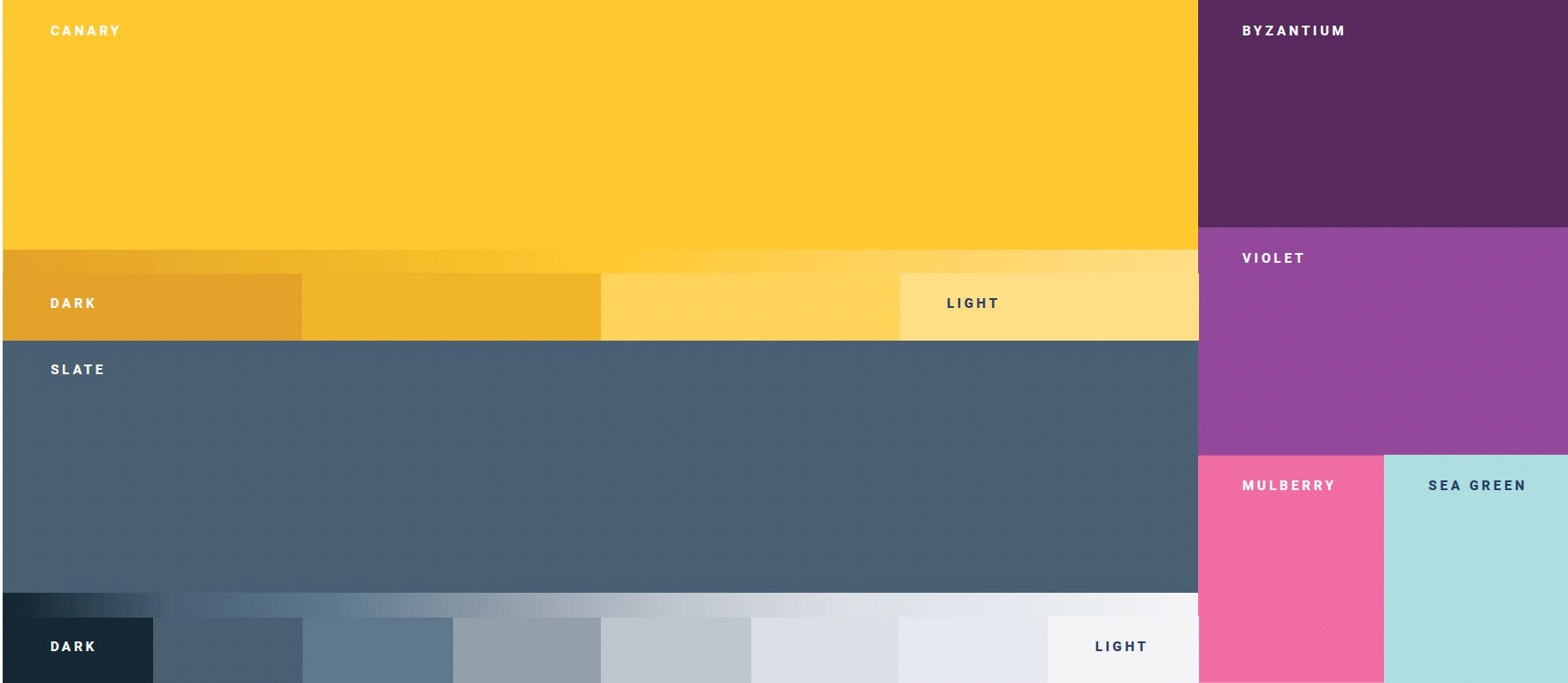
• A bold yellow, slate and purple palette to differentiate us from others
• Photography treatments create warmth in the moments, candid and global.
• A human-centered tone—warm, direct, and approachable.
While the new brand guidelines were compelling, the real challenge was bringing them to life across Egencia’s diverse content ecosystem.With the new brand in place, there was a growing priority: ebooks. These long-form assets were Egencia’s most important content format, driving lead generation and thought leadership.
However, there was a significant gap –
1. No scalable ebook or one sheeter templates existed. Teams work in isolation to create them.
2. Each ebook was being designed from scratch, leading to inconsistency and production bottlenecks
3. The expressive new brand system as it existed did not have the depth to support content creation

The Core Challenge
How could we translate a beautiful but abstract brand system into a set of tools that made content creation faster, easier, and unmistakably Egencia?
How could we translate a beautiful but abstract brand system into a set of tools that made content creation faster, easier, and unmistakably Egencia?
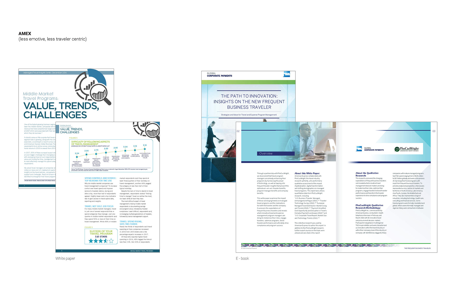
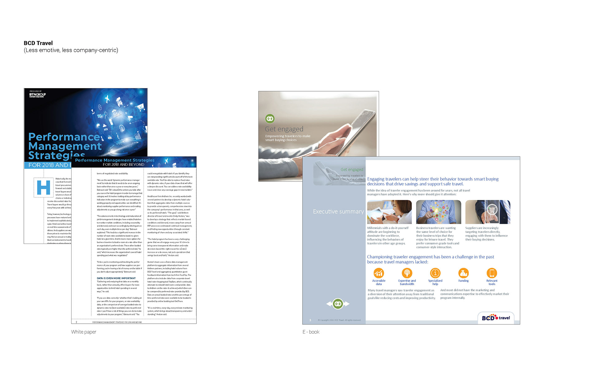
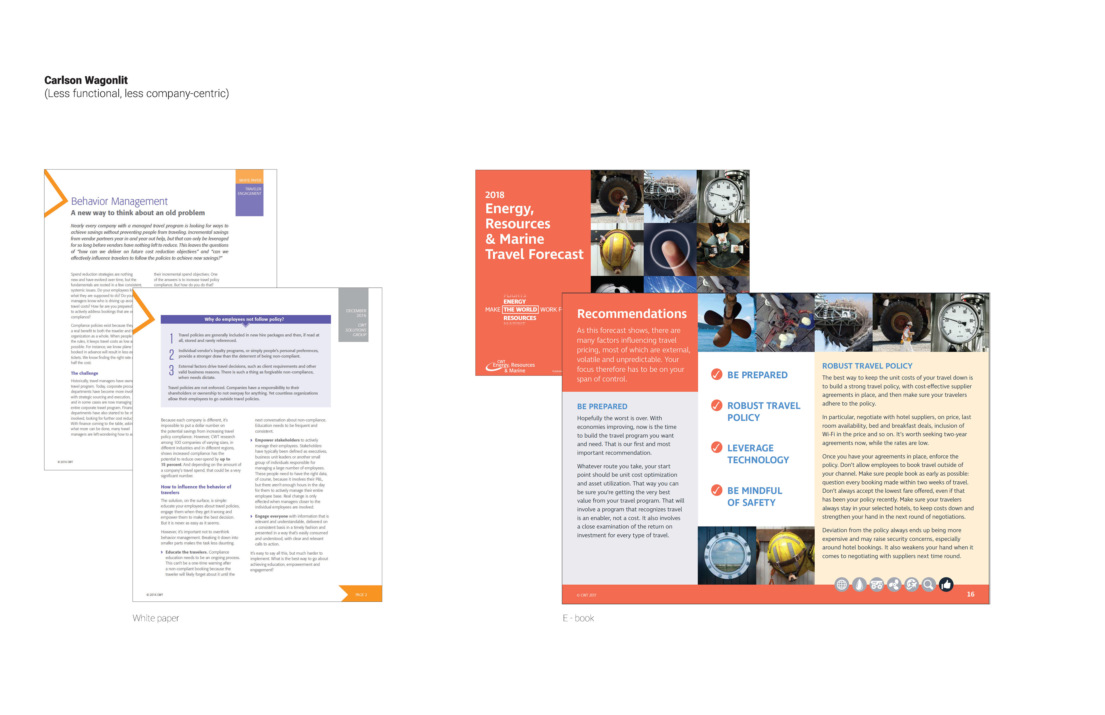
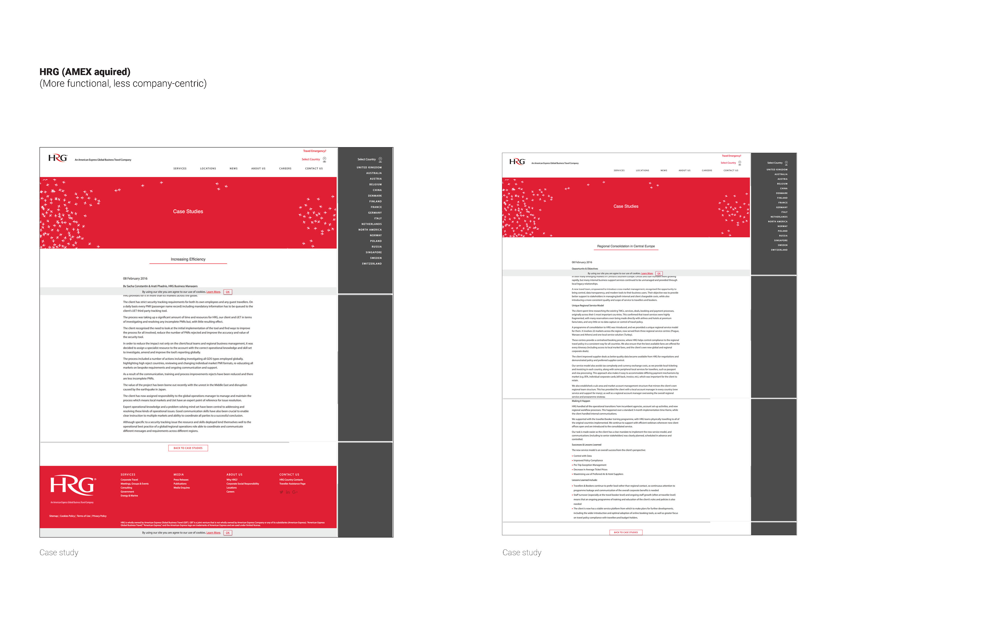
We started by doing a competitive audit of other travel management companies in the space. And discovered there were a few ways the system could be built leveraging the new brand as a strategic asset.
Competitive Audit:
The Solution
As the senior designer on the creative brand studio team, I identified multiple ways to expand the brand strategy into a robust, user-friendly visual design system, focusing on both the flagship ebook template and a broader design kit.
As the senior designer on the creative brand studio team, I identified multiple ways to expand the brand strategy into a robust, user-friendly visual design system, focusing on both the flagship ebook template and a broader design kit.
Circular Image Crop Philosophy
I established a clear editorial approach for circular
photography: circles would highlight the human element–travelers, teams, and moments of connection – making the imagery feel intentional and personal, not just decorative. The shape of a circle also represents the earth.
photography: circles would highlight the human element–travelers, teams, and moments of connection – making the imagery feel intentional and personal, not just decorative. The shape of a circle also represents the earth.
Color System Logic
I defined color usage to help create consistency:
• Yellow as the energizing accents for highlights
• Purple for pull quotes
• Comprehensive guidance for tints
• Ample white space to keep layouts modern
• Yellow as the energizing accents for highlights
• Purple for pull quotes
• Comprehensive guidance for tints
• Ample white space to keep layouts modern
This logic empowered designers and non-designers alike to make confident, on-brand color choices.
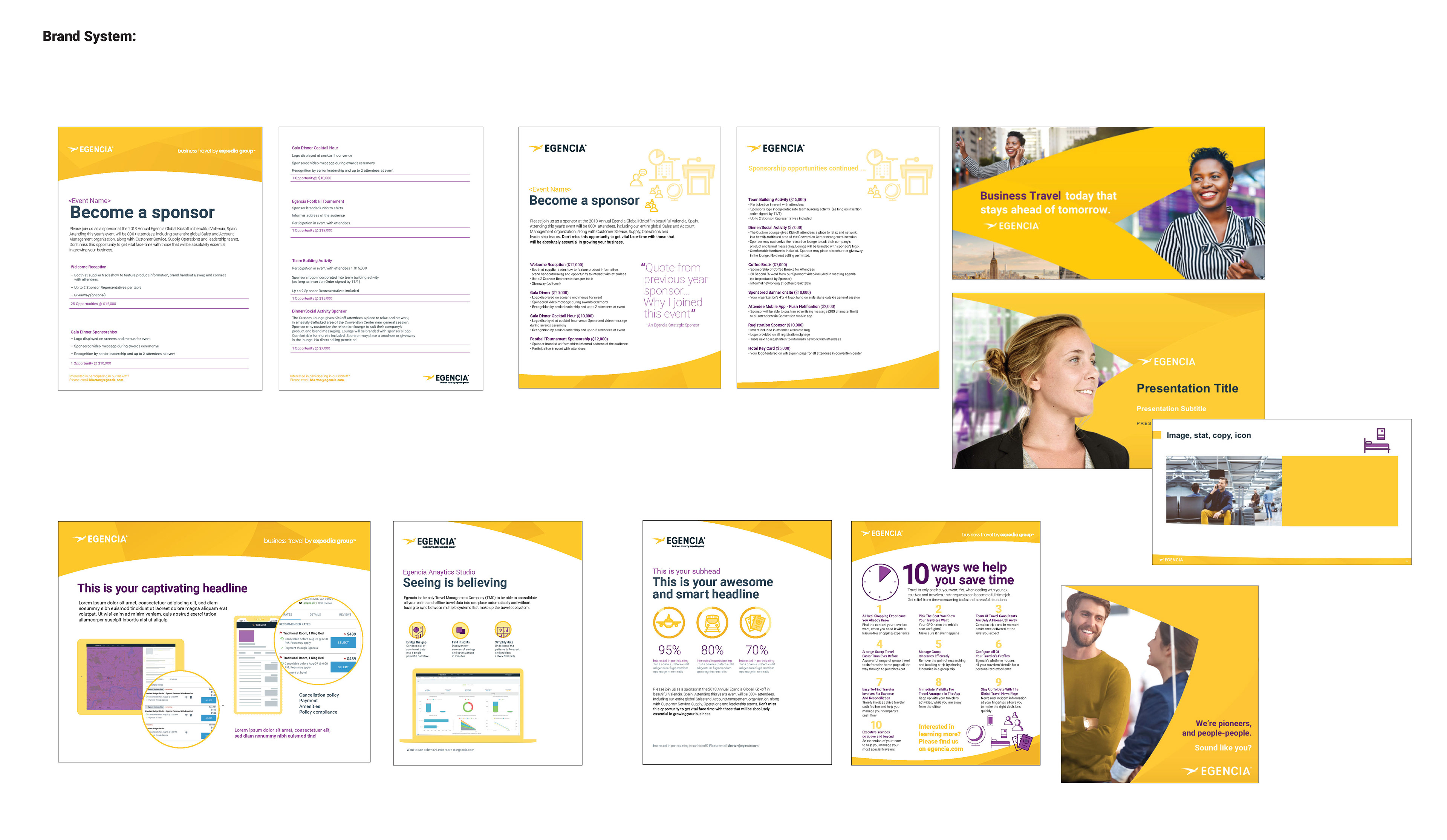
Flexible Ebook Layout Grids
I designed modular, responsive grids that balanced:
Data-forward spreads (statistics, benchmarks, and etc)
Story-forward spreads (photography, pull quotes, etc)
Story-forward spreads (photography, pull quotes, etc)
The result was a template that could flex to accommodate varied content without sacrificing brand integrity.
Broader Design Kit
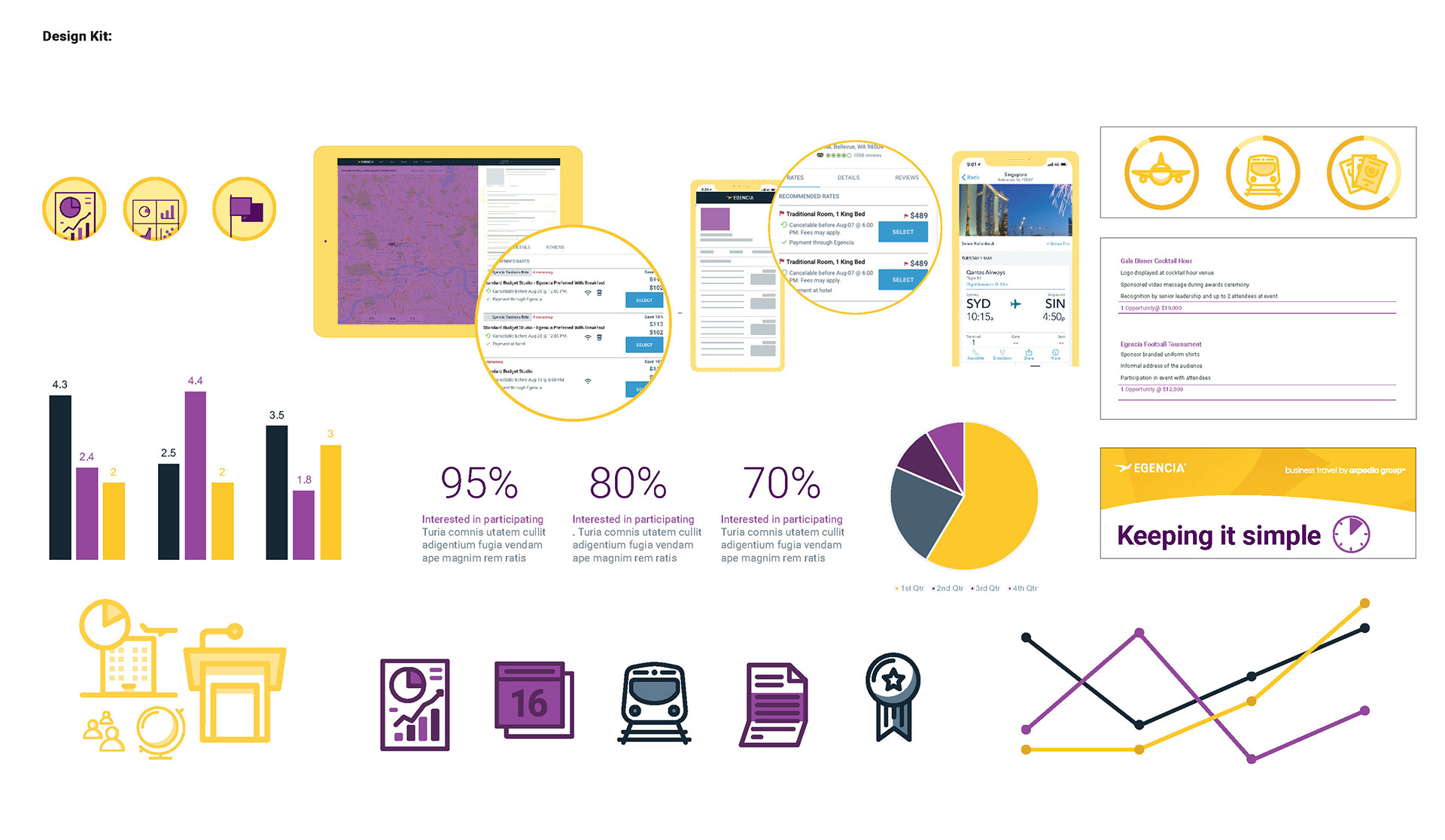
To ensure scalability, I created a comprehensive design kit featuring:
Bar, pie, and line charts using the new palette
Custom icons for most common use cases
Callout styles for quotes, statistics, and tips
Custom icons for most common use cases
Callout styles for quotes, statistics, and tips
Every element was vector, making it easy to maintain consistency across all assets.
Results
The impact of the new design system was immediate and far-reaching:

By transforming a bold new brand vision into a practical, scalable design system, I empowered teams to create content with greater speed, consistency, and impact—strengthening the company’s presence in the business travel market.
