Poster Design
Student Portfolio Day
Student Portfolio Day
Stepping into the professional world right after graduation, I was commissioned by AIGA Los Angeles to design the promotional poster for their annual Student Portfolio Review. This event is a cornerstone for design students in LA and nearby counties, drawing over 100 students and more than 50 industry professionals for a day of portfolio presentations, feedback, and networking. The assignment was both exciting and daunting: it was my first major project post-graduation, and the poster would be seen by a discerning audience of design students, AIGA members, and established professionals.

I viewed this as a 2 part challenge:
Attract and engage
design students from across the city and surrounding areas, encouraging them to participate in a valuable learning event.
design students from across the city and surrounding areas, encouraging them to participate in a valuable learning event.
Demonstrate my creative versatility
to AIGA members and professional designers, making a strong impression as a newly minted designer entering the field.
to AIGA members and professional designers, making a strong impression as a newly minted designer entering the field.
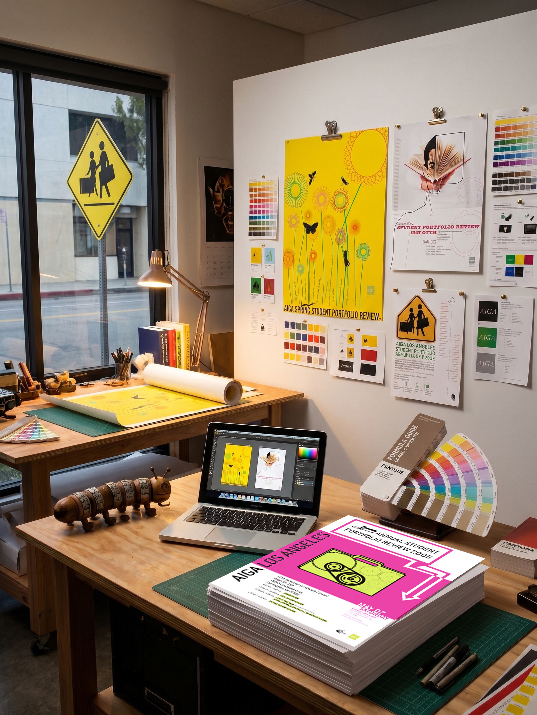
To meet these goals, I approached the project with an open and exploratory mindset, developing four distinct conceptual directions to showcase both my range and adaptability:
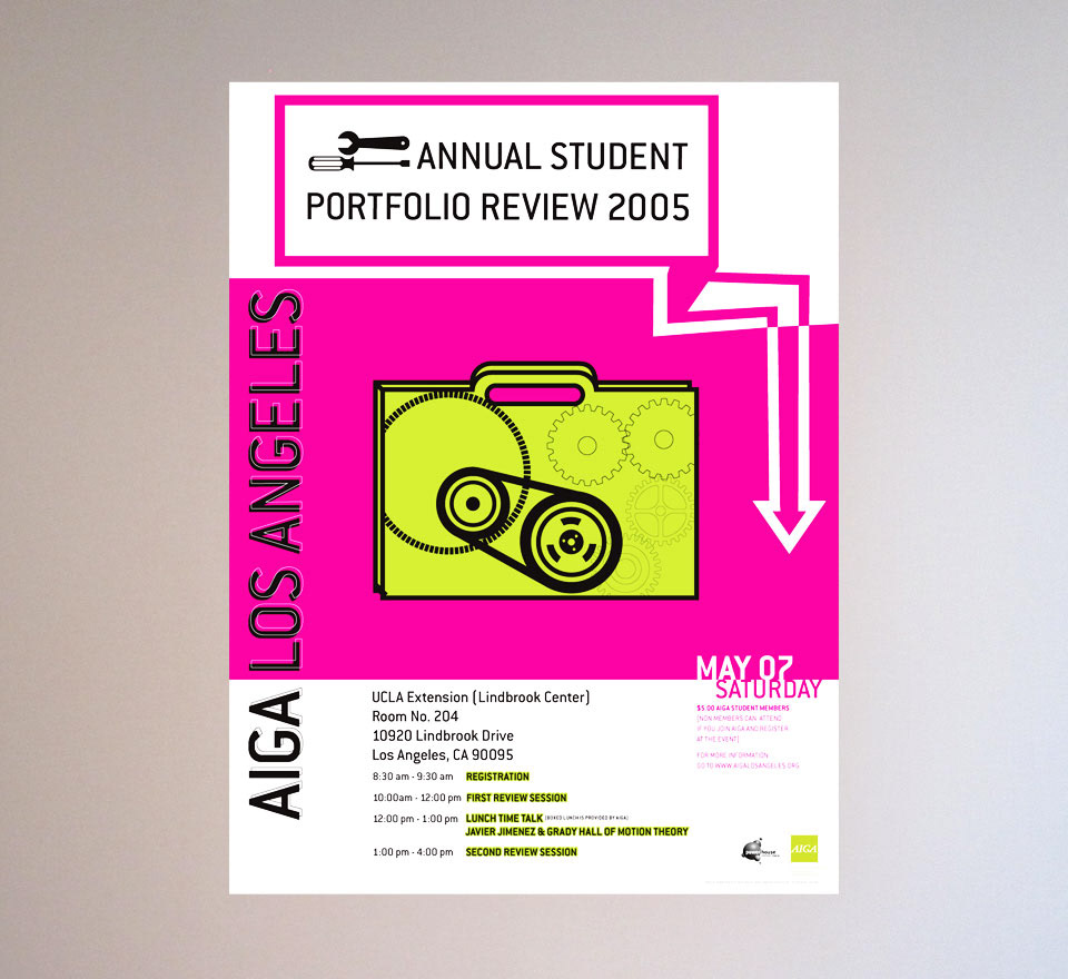
1. Tune Up
(The chosen direction)
(The chosen direction)
Used playful illustrations and bright, eye-catching colors to create a light, fun atmosphere combining symbols like tools and gears enclosed in a briefcase. Typographic treatments kept the design energetic and approachable, resonating with the event’s spirit of growth and improvement.
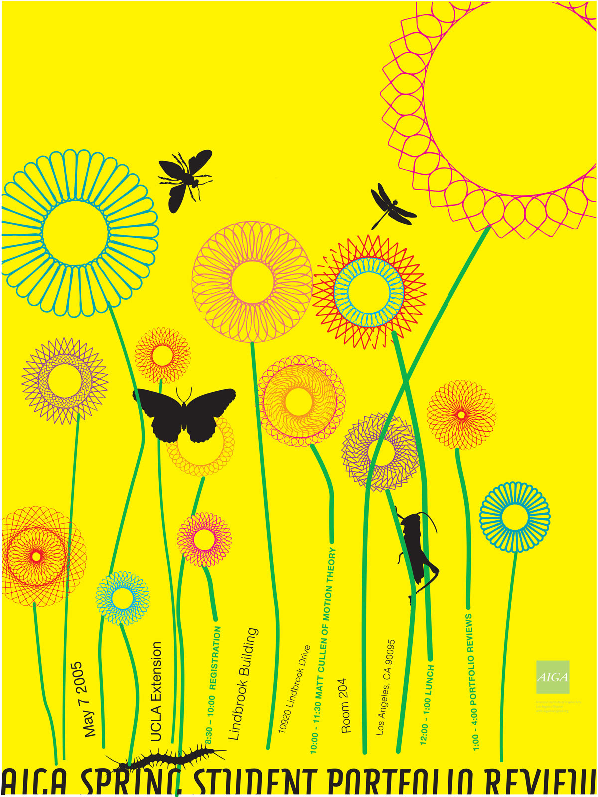
2. Spring
Tied directly to the timing of the event, this concept used expressive typography and seasonal motifs to evoke renewal and opportunity.
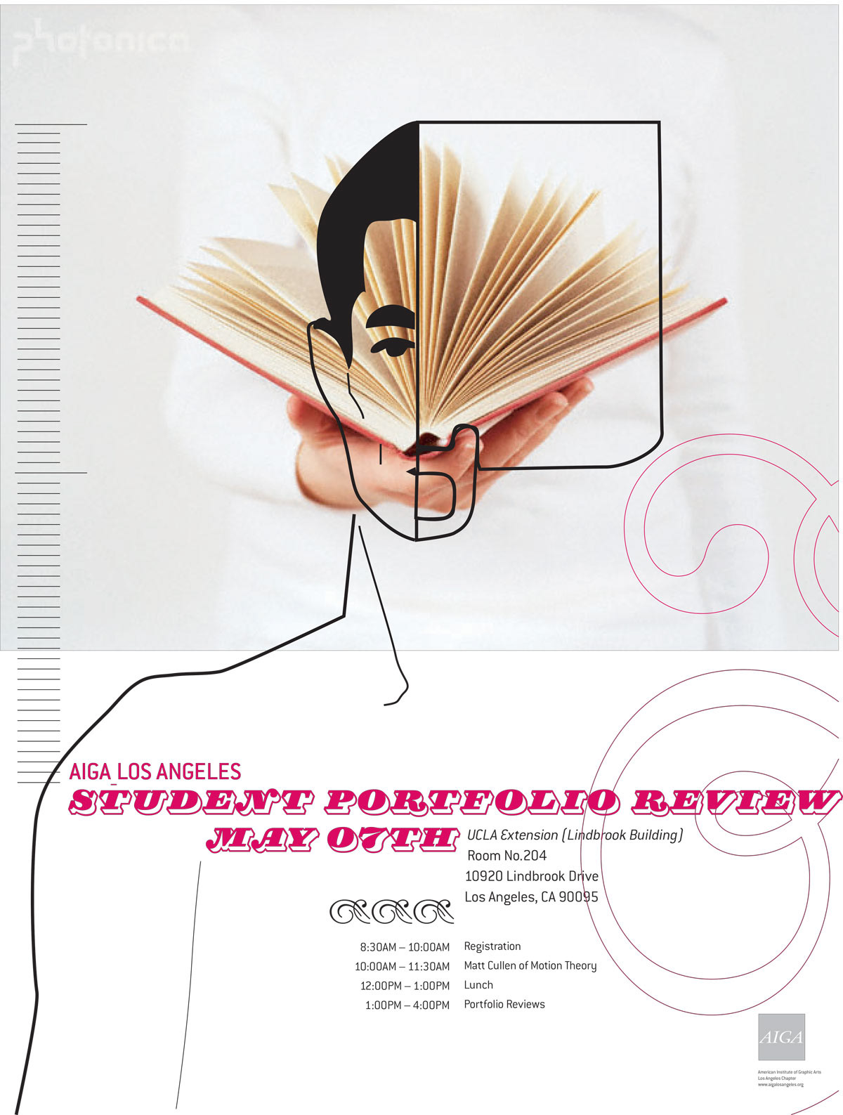
3. Left Brain Right Brain
Visually split the poster into literal (photographic) and abstract (line art, type) halves, symbolizing the balance of logic and creativity in design.
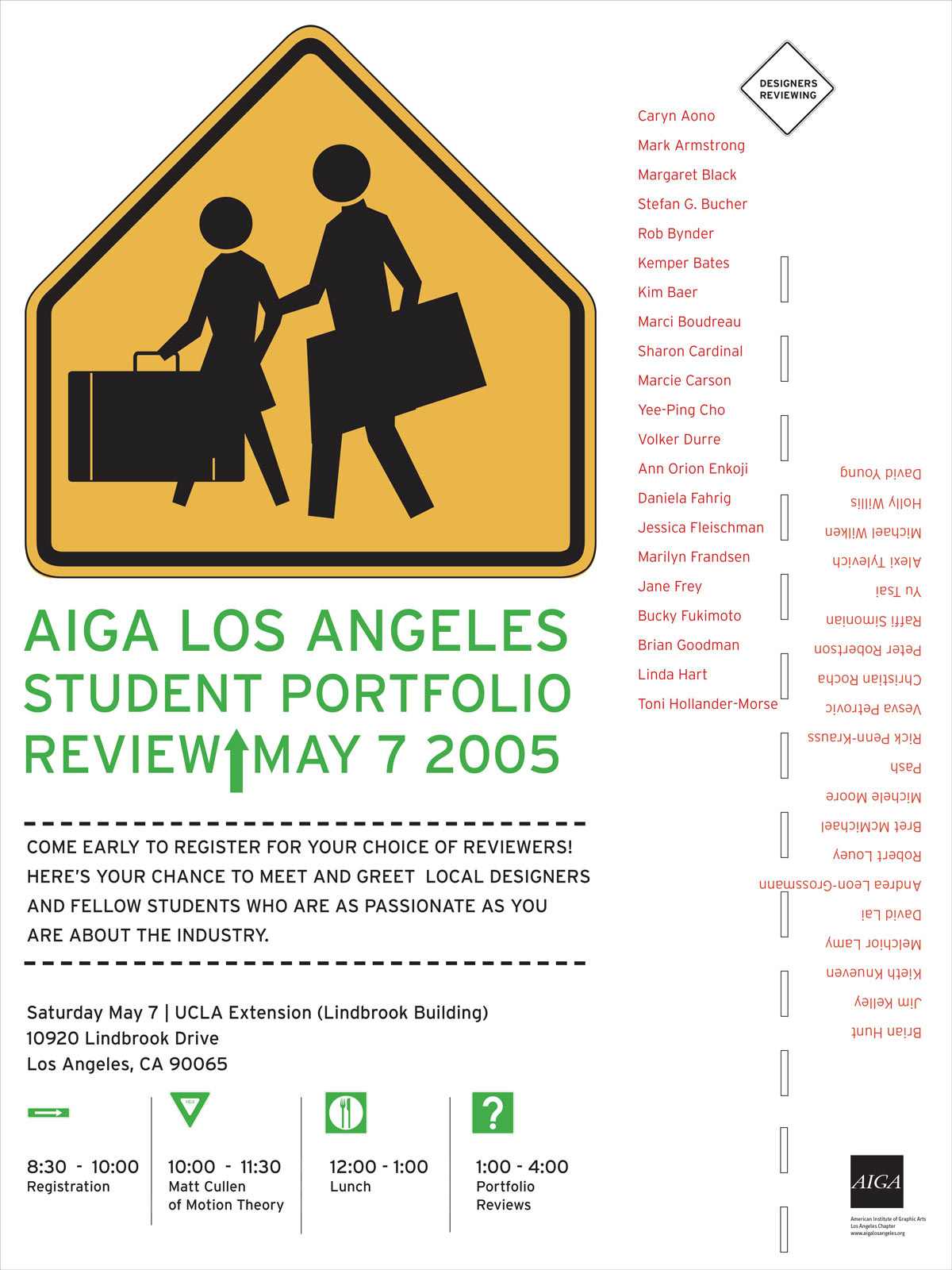
4. Students Crossing
Reimagined the iconic “children crossing” symbol, infusing it with whimsy and educational relevance to connect with student audiences.
Selected Direction
Spring
Left Brain Right Brain