Portfolio Day
Poster Design
Poster Design
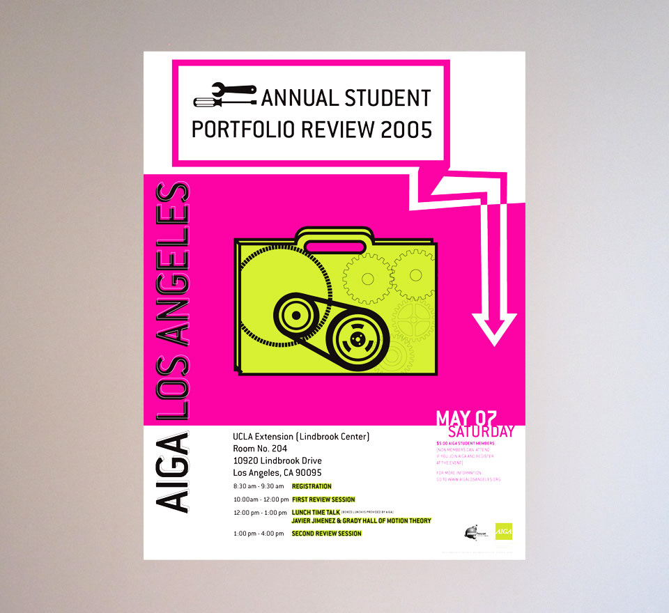
This is one my favorite projects with the Los Angeles chapter of AIGA. I was given the opportunity to design a poster for the Los Angeles Chapter of the AIGA. This poster promotes an annual portfolio review open to all students in the city and nearby counties. I used the phrase “getting a tune-up” as a metaphor for getting a review. The typographic treatments and illustrations keep the design light and fun. My goal was to keep the audience captivated so I chose bright colors to make it more attractive to the eye.
Here a few of the other directions I created while working on this project.
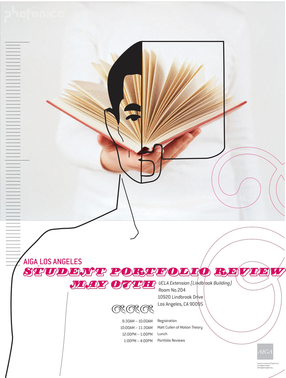
Direction 1: Left Brain Right Brain
My concept was to divide up the space in half and have literal and
abstract elements create the visuals for the poster. The photography
conveys the clean and bright mood to contrast against the
line art and type.
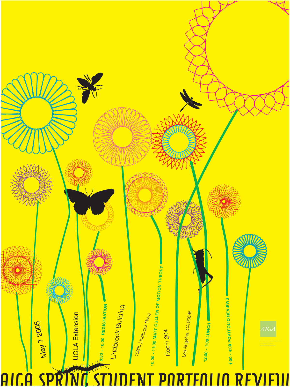
Direction 2: Spring
This design connected strongly to the timing of the review (during
the Spring) as well as using somewhat expressive typography to
spell out all the details.
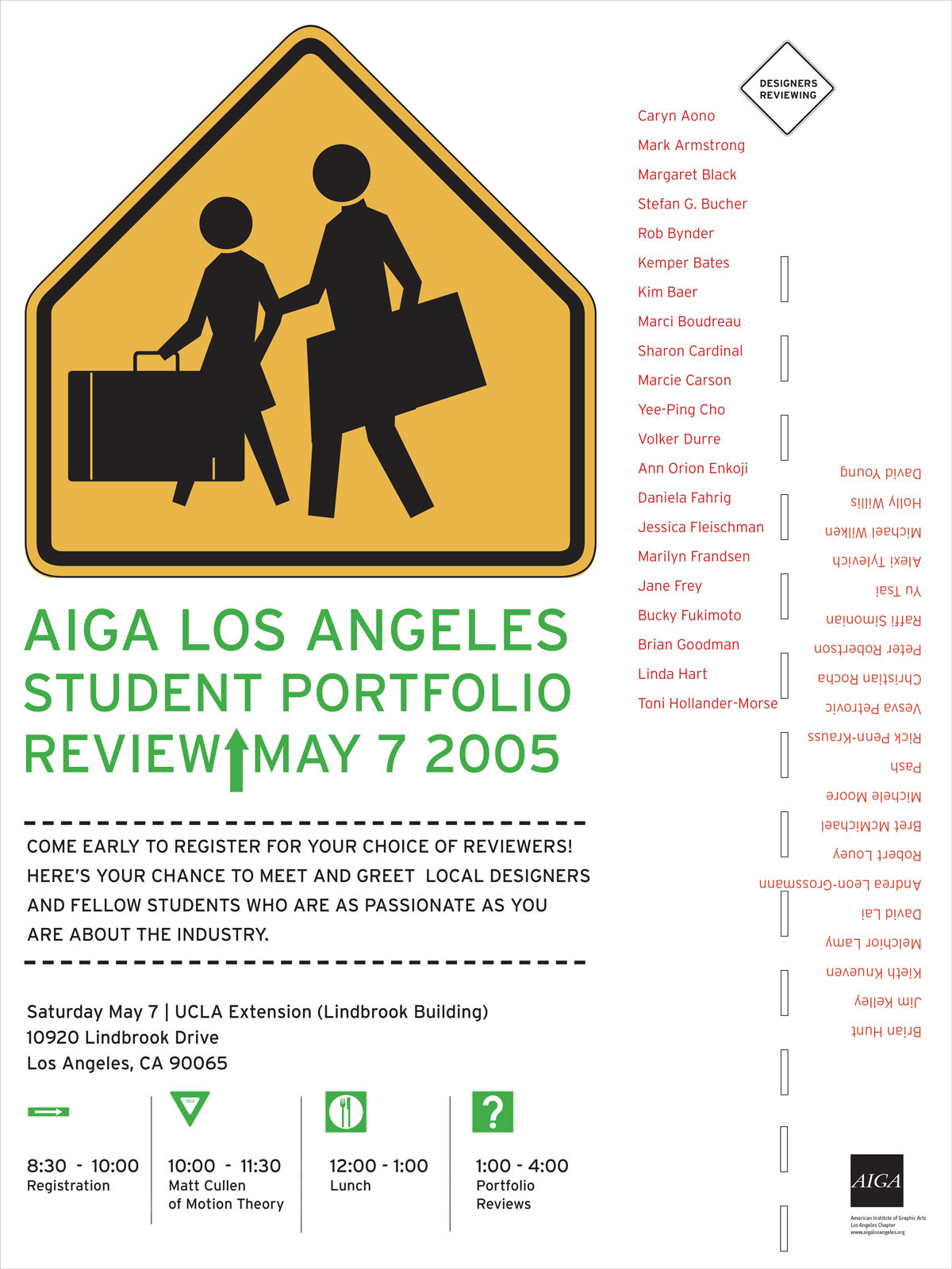
Direction 3: Crossing
The design uses iconic symbols that one associates with school
and feels young. The iconic “children crossing” iconic symbol was
the focal point and I manipulated the figures to make it more relevant
to a portfolio review but still express education and students
with a little whimsy.